
The Client is an award-winning FinTech company that helps people refinance student loans.
The Redesign of the existing rate comparison tool aims at providing a better experience for users to understand refinancing and the process of it, to get the pre-approved best rates efficiently, and to be able to understand the economics of their rate options easily. Therefore, the borrowers can select a refinancing rate confidently and ultimately refinance successfully.
Lead UX Designer
Front End Engineer
Product Manager
Marketing Team
FinTech Product
B2C FinTech Application
Sketch | InVision
Adobe PS | AI
Abstract | Zeplin


Student Loan Refinancing is one of the most effective ways to help student loan borrowers reduce their loan costs. A rate comparison tool helps the borrowers to understand refinancing better and get the best refinancing rate quotes.With the previously existing design of the tool, customers have reported that they feel confused about refinancing and are not motivated enough to move forward with the progress.
.png)
We kick off the design project by re-evaluating the users’ needs and pain points.
Based on the existing quantitative marketing analytics, there are two major targeted user groups: first-time borrowers who want to refinance their student loans, and experienced borrowers who have at least refinanced once.
Among each targeted group, some borrowers are graduates, and the others are their parents who have borrowed Parent PLUS loans.
Based on a conversation with the internal customer-facing team and direct interactions with five prospective users, we figured that:
For first-time borrowers, they need to understand refinancing and the process of refinancing a student loan, and without enough educational information, they feel anxious and uncomfortable moving forward with the progress.
For more experienced borrowers, their main goal is to get through the rate comparison tool quickly to find the best rate, and it would be frustrating for them if the tool is complicated and confusing.

.png)


.png)


I did a competitors analysis on other student loan refinancing marketplaces and lender sites. I try to observe how these companies are creating the student loan refinancing user experience.
I mainly focused on:

Too Much Effort at One Time
The old design used a single-page form that requires a lot of personal information, which discourages users from finishing the task.
Lack of Clarity
The old design did not provide enough information for users to understand the process and why certain information is requested
Lack of Trust Building
The old design did not provide enough information for the users to trust the tool to use it

.png)

.png)
We interview ~25 prospective users (75% student borrowers, 25% parent borrowers, recruited from usertesting.com) regarding the refinancing journey and modify the wireframe and flow according to the insights we gained.


.png)
Where users start the journey…
.png)

Where users start the journey…
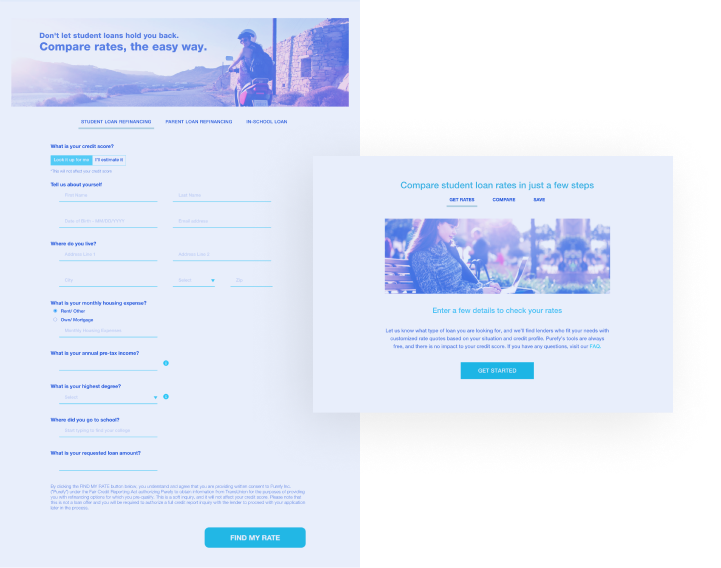
Where users can enter their loan-related information to get the best rates…
.gif)
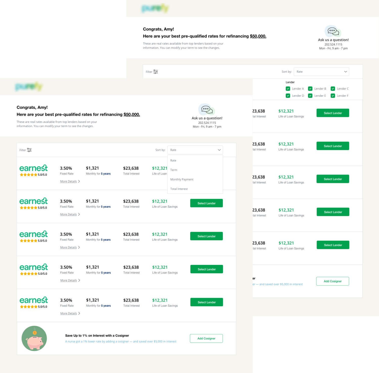
Where users can check their rates and learn more about each option.

They can filter & sort for different options and get alerts if they choose to add a cosigner


Where users can enter tUsers now can learn more about refinancing and get their best rates within minutes anywhere they want…heir loan-related information to get the best rates…
.gif)
Borrowers can choose to add a cosigner, and the cosigner will be able to add their information easily as well.


The "rate comparison tool redesign project" is one of the first UX projects I participated in as a UX designer for the entire product cycle.Through this experience, I did not only learn more about bettering my design skills but also become better at communicating my research insight and design ideas with the team. I realized that communication is always the key to killing confusion. And great communication makes sure that everyone is always on the same page.
Sometimes different software or methods are also needed when communicating with a different role. For instance, I became much more familiar with Jira tickets, Confluence as a result of trying to communicate the progress of my work better; I became an "expert" of Zeplin when communicating my design file with the front end developers.All these conversations that happen throughout the project tie everyone on the team together and have contributed to the success of the project.
Sometimes the design schedule could be a bit tight and designers need to come up with a solution quickly. As a UX designer, it is always important to put the users at the center even during the busiest time. With a limited amount of time and a need to do user research or user testing, the UX designer needs to be creative sometimes.
For instance, before launching the redesign project, to gain a deeper comprehensive understanding of our users, we recruited a group of users from usertesting.com to do interviews with them. These interviews last 1 hour each and often require 2-3 people at one time(1 to interview and the others to document). The overall timeline of this research could be quite long. When a quick user research/testing is needed, there is not always enough time to run a large group interview, so what I did was to recruit a small focused group of 5 people and run a smaller test session among them. For some other features, A/B testing after the release is the most efficient approach.
UX design is not a one-time permanent solution. Instead, with new business needs and user needs, the design is always going to be updated and upgraded.UX designers must refer and reflect on past designs to continue to create a better user experience, therefore, documenting the design work is just as important as the design itself.
The documentation will provide details on how the design comes to be: research, how certain design decisions are made, what does the design guidelines look like. It makes the design much more communicable and makes collaboration across teams a more seamless experience.


